Getting started
Reading the screen
The sidebar, the page header, lock icons, and the small conventions that mean the same thing on every page in the app.
3 min read
On this page
The three parts of every page
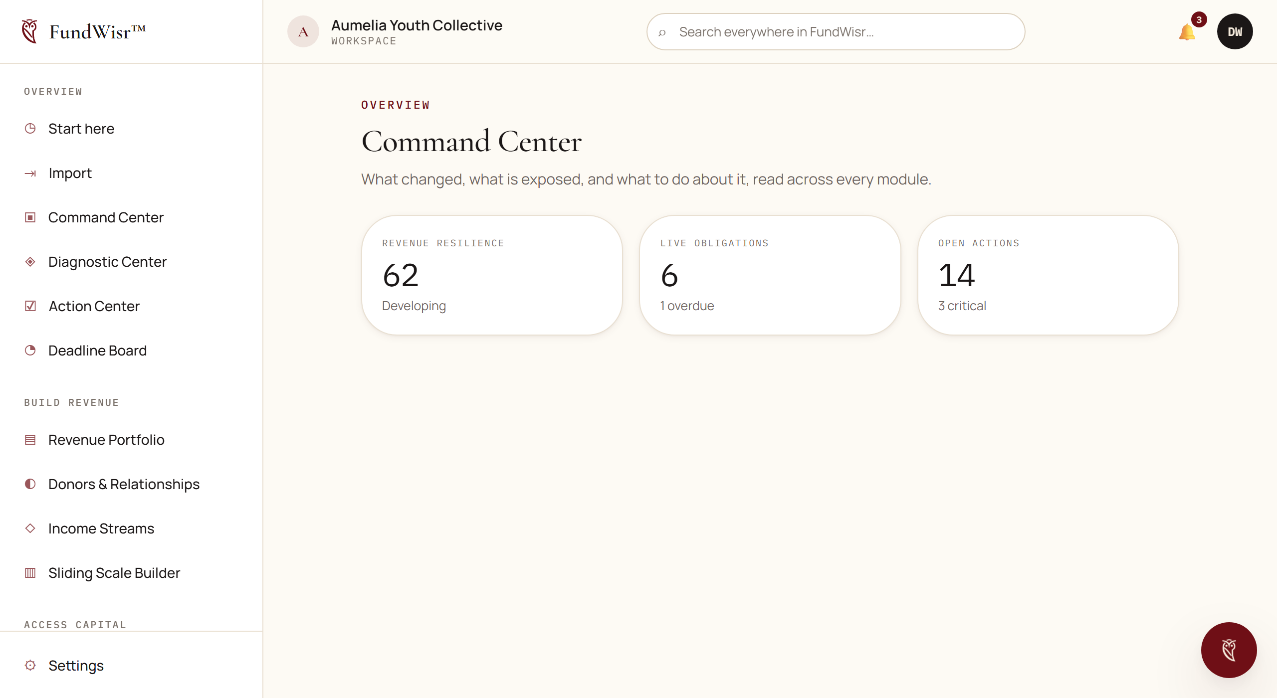
- The sidebar
- Every tool you can reach, grouped by what it is for: Overview, Build revenue, Access capital, Financial management, Strengthen organization, Grow & expand, Events & engagement, Learn & connect, and Work & knowledge. The grouping is by purpose, not by how often you will use it.
- The top bar
- Search across everything, the organization switcher if you belong to more than one, and your account menu.
- The page header
- Small text on top gives the sidebar group you are in, then the page name. If you are ever unsure where you are, that pair of lines tells you.
Conventions that mean the same thing everywhere
| What you see | What it means |
|---|---|
| A lock next to a sidebar item | Your plan does not include that module. Opening it shows what it does and which plan adds it. |
| An item that is greyed out with no lock | Your role does not have access. Ask whoever owns the account, not support. |
Coming soon on an item | Built and not yet released. It will appear without you doing anything. |
| A gold badge on a count | Nothing recorded yet in that step. |
| A green badge on a count | That step has records behind it. |
Back at the top left of a page | Returns you where you came from, not to a fixed page. |
Finding things
- Search in the top bar looks across your records, not just page names. Typing a donor's surname finds the donor.
- Start here, at the top of the sidebar, is the setup checklist. It reads your actual records, so a step cannot show as done once the records behind it are gone.
- The AI Co-Strategist answers questions in plain language about your own data, and can create tasks and pull reports on request.
If the software is hard to read
FundWisr has a full set of reading preferences: four color themes including two high contrast ones, text scaling up to 200%, reduced motion, increased line, letter, and word spacing, a high-legibility typeface, a narrower reading column, and stronger focus outlines.
They are settings, not a novelty theme switcher: whatever you choose applies on every page, on every device you sign in from, from the first moment a page paints. See Setting up how you read.
Read next
- Setting up how you readThemes, text size, spacing, motion, and focus. How to make FundWisr readable for you, and have it stay that way everywhere.
- Plans and what each one includesThe five plans, what each one unlocks, how the AI allowance works, and what happens to your records if you change plan.
- Start hereThe setup checklist that reads your real records, shows what each thing you enter turns on, and always names one next step.
Something here wrong, missing, or out of date? Email support@fundwisr.ai and tell us which chapter. Documentation defects are treated as defects.